Floating Exchange Rate Determination
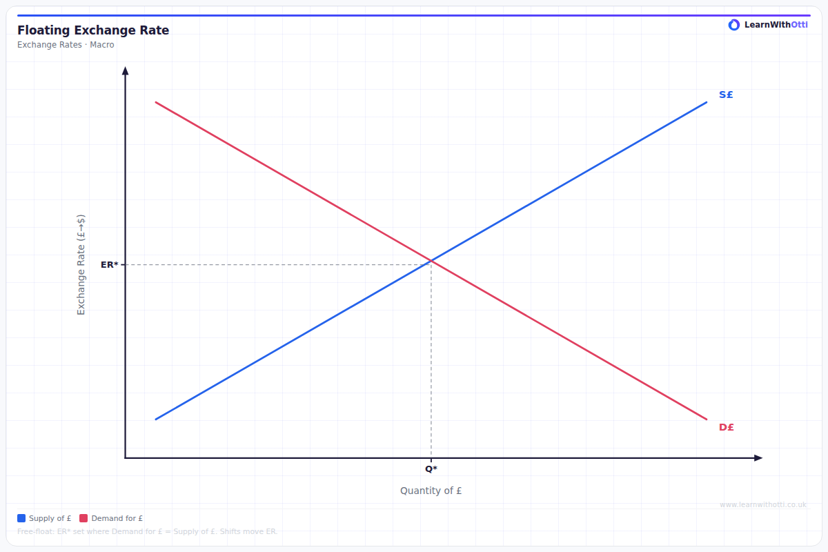
Supply and demand for currency diagram showing how the exchange rate is determined in a free-floating regime by the interaction of demand and supply of the currency.
Printable preview
Download a static PNG of this diagram to print or include in revision notes.
Download PNGWhat this diagram shows
This diagram shows how the exchange rate of a currency is determined in a free market through the interaction of supply and demand forces. The vertical axis represents the exchange rate (price of the domestic currency in terms of foreign currency), while the horizontal axis shows the quantity of the domestic currency being traded. The equilibrium exchange rate is established where the demand curve (from foreigners wanting to buy the currency) intersects with the supply curve (from domestic residents wanting to exchange their currency for foreign currency).
Key points
- The demand curve slopes downward because as the exchange rate falls (currency becomes cheaper), foreign demand for exports and domestic assets increases
- The supply curve slopes upward because as the exchange rate rises (foreign currency becomes cheaper), domestic residents demand more foreign goods and assets
- Equilibrium occurs where supply equals demand, determining both the exchange rate and quantity of currency traded
- Shifts in demand (due to factors like interest rates, inflation, or economic growth) will change the equilibrium exchange rate
- The exchange rate adjusts automatically in a floating system without government intervention, unlike fixed exchange rate systems
Exam tip
Always clearly label which currency is being measured on each axis - examiners frequently see students confuse whether they're showing the price of pounds in dollars or dollars in pounds. Show your understanding by explaining that equilibrium occurs where demand for the currency (from those wanting to buy UK goods/assets) equals supply of the currency (from UK residents wanting foreign goods/assets).
Common mistakes
Students often confuse which way the curves shift when explaining the impact of economic changes, particularly mixing up whether higher interest rates increase demand or supply. Many also forget that both the exchange rate AND the quantity of currency traded change when the curves shift, not just the exchange rate.
Exam board notes
All major exam boards treat this diagram identically in terms of basic construction and interpretation. However, AQA and Edexcel tend to emphasise the link to balance of payments components more heavily, while OCR often connects it more explicitly to monetary policy impacts.
Related diagrams
Ask Otti about this diagram
Our AI tutor can walk you through every curve, explain exam technique, and quiz you on it.