Money Market Equilibrium
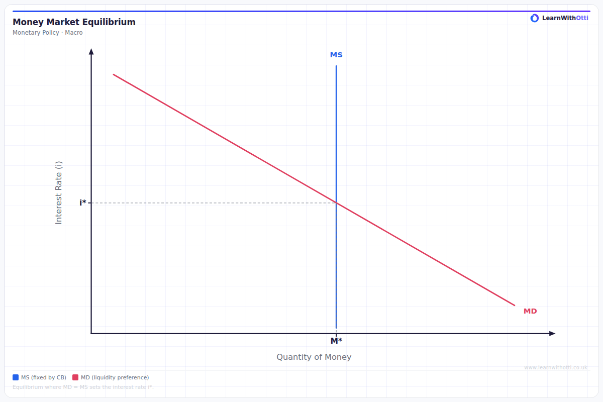
Diagram showing the money market with money supply (vertical) and money demand (downward-sloping), determining the equilibrium interest rate.
Printable preview
Download a static PNG of this diagram to print or include in revision notes.
Download PNGWhat this diagram shows
The money market equilibrium diagram shows how interest rates are determined by the interaction between money supply and money demand. The vertical money supply curve reflects that central banks control the money supply independently of interest rates, while the downward-sloping money demand curve shows that people demand less money when interest rates are high (since the opportunity cost of holding cash increases). Where these curves intersect determines the equilibrium interest rate that balances the amount of money people want to hold with the amount available in the economy.
Key points
- Money supply (MS) is vertical because central banks set it independently of interest rates through monetary policy tools
- Money demand (MD) slopes downward because higher interest rates increase the opportunity cost of holding money, reducing demand
- Equilibrium occurs where MS intersects MD, determining both the interest rate and quantity of money in circulation
- Increases in money supply shift MS right, lowering interest rates; increases in money demand shift MD right, raising interest rates
- The diagram directly links to monetary policy transmission - central banks change MS to influence interest rates and economic activity
Exam tip
Students often confuse which axis shows interest rates - remember it's always the vertical axis, with quantity of money on the horizontal. Examiners are impressed when you can link shifts in money demand to specific economic events like inflation expectations or GDP changes, rather than just memorising abstract shifts.
Common mistakes
The most common error is drawing money supply as upward-sloping instead of vertical, failing to understand that central banks set money supply as a policy choice. Students also frequently confuse this with loanable funds theory, mixing up the concepts of money demand with demand for loans.
Exam board notes
All major exam boards treat this diagram identically in terms of basic structure. However, AQA and Edexcel place slightly more emphasis on linking money market equilibrium to the transmission mechanism of monetary policy, while OCR focuses more on the theoretical underpinnings of money demand.
Related diagrams
Ask Otti about this diagram
Our AI tutor can walk you through every curve, explain exam technique, and quiz you on it.