National Living Wage
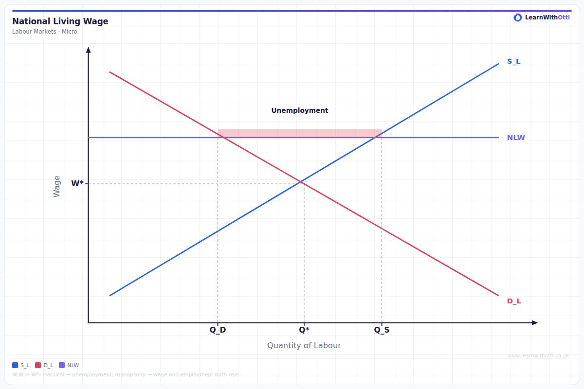
Labour market diagram showing the National Living Wage set above equilibrium, creating unemployment (excess supply of labour) or reducing it in a monopsony market.
Printable preview
Download a static PNG of this diagram to print or include in revision notes.
Download PNGWhat this diagram shows
The National Living Wage diagram shows what happens when the government sets the NLW as a wage floor above the market equilibrium in a competitive labour market. The mechanism is identical to any minimum wage analysis: a legally binding wage floor above W* creates excess supply of labour. In current UK policy, the NLW is the higher statutory minimum that applies to workers aged 23 and over, while the National Minimum Wage refers to the lower age-banded rates for younger workers and apprentices — this diagram illustrates the NLW specifically, not the NMW.
Key points
- The NLW is set as a horizontal line above the equilibrium wage rate, creating a binding price floor
- Employment falls from the equilibrium level as firms demand fewer workers at the higher wage
- Unemployment increases due to both job losses and additional workers entering the market attracted by the higher wage
- The NLW applies specifically to workers aged 23 and over in current UK policy — a different (lower) NMW rate applies to younger workers and apprentices
- In a monopsony labour market, the same wage-floor logic can instead raise both wages and employment toward the competitive outcome
Exam tip
Make clear this is the same wage-floor mechanism as the National Minimum Wage diagram, just applied to the specific NLW rate — examiners want to see you can apply the standard minimum wage analysis to whichever named policy the question asks about, not that you think NLW and NMW are separate models.
Common mistakes
Students often treat 'National Living Wage' and 'National Minimum Wage' as interchangeable terms rather than recognising the NLW as the specific higher rate for over-23s within the broader minimum wage system. As with any minimum wage diagram, students also often confuse the fall in employment with total unemployment, or draw the wage floor below equilibrium, which would make it non-binding.
Exam board notes
All major exam boards treat the underlying diagram identically to the National Minimum Wage case. Questions naming the NLW specifically expect students to recognise it as the current UK statutory floor for workers aged 23+, distinct from the lower age-banded NMW rates.
Related diagrams
Ask Otti about this diagram
Our AI tutor can walk you through every curve, explain exam technique, and quiz you on it.