Price Elasticity of Demand — Inelastic
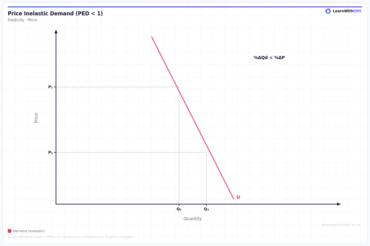
Demand curve with PED < 1 (inelastic), showing that a percentage price rise leads to a smaller percentage fall in quantity demanded. Revenue rises when price rises.
Printable preview
Download a static PNG of this diagram to print or include in revision notes.
Download PNGWhat this diagram shows
This diagram shows inelastic demand, where consumers are relatively unresponsive to price changes - the demand curve is steep. When price increases from P1 to P2, quantity demanded only falls slightly from Q1 to Q2, meaning the percentage change in quantity is smaller than the percentage change in price. This gives a PED value between 0 and -1 (or 0 and 1 in absolute terms), indicating that total revenue increases when price rises. This concept is crucial for understanding why firms might raise prices on essential goods and how consumers respond to price changes for necessities.
Key points
- PED is between 0 and -1 (inelastic) - percentage change in quantity demanded is less than percentage change in price
- The demand curve is steep/vertical, showing consumers don't significantly reduce purchases when price increases
- Total revenue moves in the same direction as price - when price rises, total revenue increases despite lower quantity sold
- Common examples include necessities (petrol, medicines), goods with few substitutes, or addictive products (cigarettes)
- The more vertical the curve, the more inelastic demand becomes - perfectly inelastic demand would be a vertical line
Exam tip
Always remember to explain WHY demand is inelastic for the product in your example - don't just state that PED < 1. Examiners are impressed when students can link the steepness of the curve to real-world factors like necessity, lack of substitutes, or addictive properties.
Common mistakes
Students often confuse a steep curve with elastic demand or incorrectly state that PED is positive for inelastic goods. Remember that PED is always negative due to the law of demand - we just focus on the absolute value when categorising elasticity.
Exam board notes
All major exam boards treat this diagram identically. However, OCR tends to place slightly more emphasis on calculating PED values from the diagram, while AQA often focuses more on explaining the business implications of inelastic demand.
Related diagrams
Ask Otti about this diagram
Our AI tutor can walk you through every curve, explain exam technique, and quiz you on it.