PED and Total Revenue
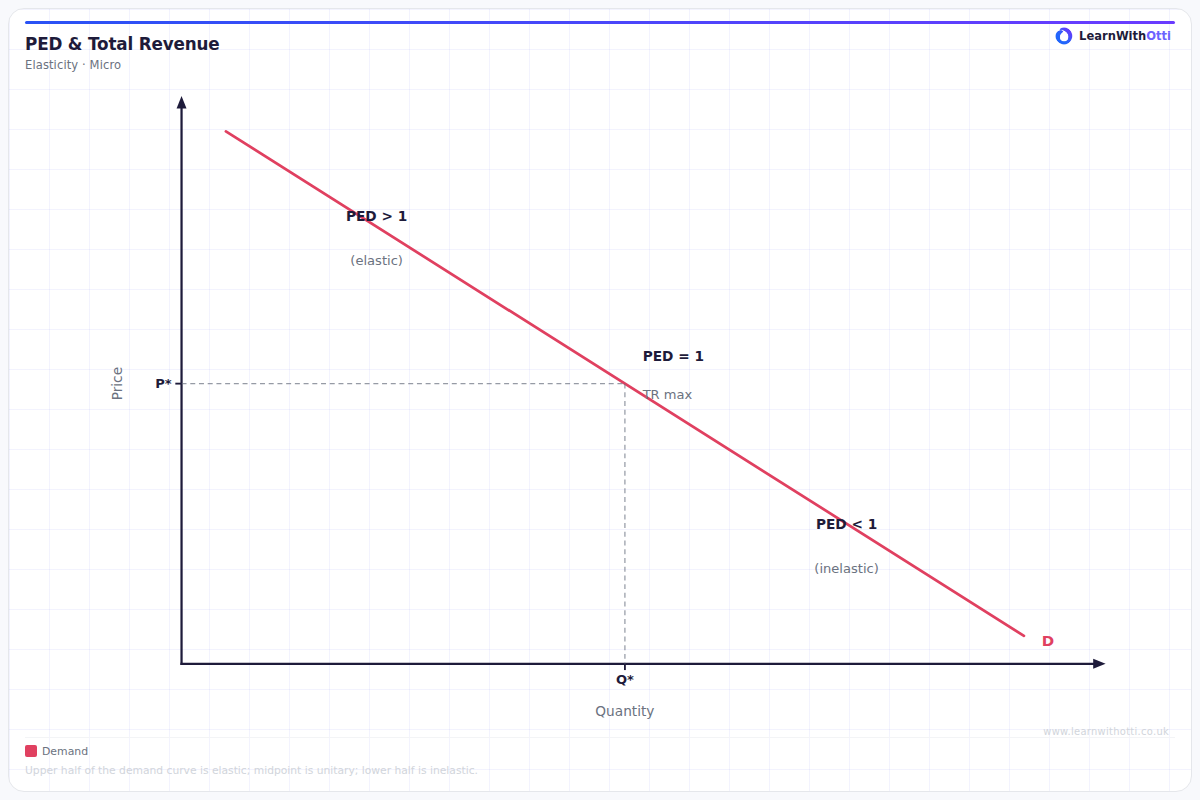
Diagram linking the price elasticity of demand to total revenue, showing how revenue changes as price changes along an elastic or inelastic demand curve.
Printable preview
Download a static PNG of this diagram to print or include in revision notes.
Download PNGWhat this diagram shows
This diagram illustrates the crucial relationship between price elasticity of demand (PED) and total revenue, showing how changes in price affect a firm's income differently depending on whether demand is elastic or inelastic. When demand is elastic (PED > 1), price cuts increase total revenue because the percentage increase in quantity sold exceeds the percentage decrease in price. Conversely, when demand is inelastic (PED < 1), price increases boost total revenue as the percentage fall in quantity is smaller than the percentage price rise. Understanding this relationship is essential for firms making pricing decisions and for analysing market behaviour.
Key points
- Elastic demand (PED > 1): Price and total revenue move in opposite directions - lower prices increase total revenue
- Inelastic demand (PED < 1): Price and total revenue move in the same direction - higher prices increase total revenue
- Unit elastic demand (PED = 1): Total revenue remains constant regardless of price changes
- The relationship exists because total revenue = price × quantity, and PED determines which effect dominates when price changes
- Firms can use this knowledge strategically - luxury goods (elastic) benefit from price cuts during sales, while necessities (inelastic) can sustain price increases
Exam tip
Students often forget to explain WHY total revenue changes differently with elastic vs inelastic demand - don't just state the relationship, explain the underlying logic. Examiners are impressed when you can link this to real business examples and explain how firms use this knowledge for pricing strategies.
Common mistakes
Students frequently confuse the direction of the relationship, incorrectly stating that higher prices always increase total revenue regardless of elasticity. Many also fail to explain that this occurs because of the proportional changes in price versus quantity demanded.
Exam board notes
All major exam boards treat this diagram identically, though Edexcel tends to emphasise the mathematical relationship more heavily while AQA focuses slightly more on real-world business applications.
Related diagrams
Ask Otti about this diagram
Our AI tutor can walk you through every curve, explain exam technique, and quiz you on it.