Price Elasticity of Supply — Elastic
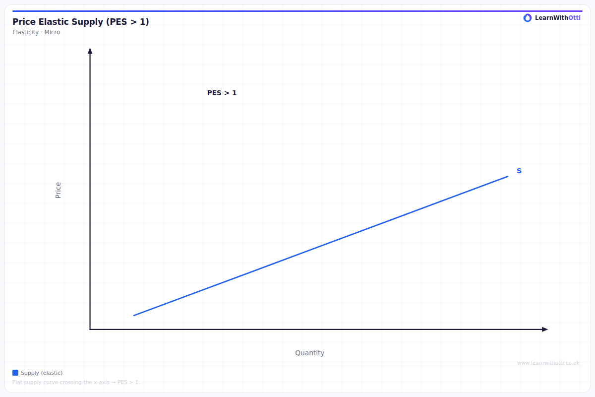
Supply curve with PES > 1 (elastic), showing that producers can increase output proportionally more than a price rise. Common in industries with spare capacity.
Printable preview
Download a static PNG of this diagram to print or include in revision notes.
Download PNGWhat this diagram shows
This diagram shows elastic supply, where producers are highly responsive to price changes - a small price increase leads to a proportionally larger increase in quantity supplied. The supply curve is relatively flat, indicating that firms can easily expand production when prices rise. This typically occurs when businesses have spare capacity, flexible production processes, or can store goods easily, making it profitable and feasible to quickly increase output in response to higher prices.
Key points
- Price Elasticity of Supply (PES) is greater than 1, meaning percentage change in quantity supplied is greater than percentage change in price
- The supply curve is relatively flat/shallow, showing high responsiveness to price changes
- Occurs when firms have spare capacity, flexible production methods, or ability to store goods
- Small price increases lead to large increases in quantity supplied, maximizing producer revenue potential
- Common in industries with excess capacity, simple production processes, or service sectors
Exam tip
Always remember that elastic supply has a PES value greater than 1, not just a steep curve - examiners love seeing the actual numerical relationship explained. The most impressive answers link the gradient to real-world factors like spare capacity, storage ability, and production flexibility.
Common mistakes
Students often confuse the gradient with elasticity value - a flat curve doesn't automatically mean PES = infinity, you must calculate the actual percentage changes. Many also forget that elasticity can vary along the same supply curve, so context and the specific point matter.
Exam board notes
All major exam boards treat this diagram identically, focusing on the relationship between curve gradient and PES values. However, AQA tends to emphasize real-world applications more heavily, while OCR often links it more explicitly to firm theory and production capacity.
Related diagrams
Ask Otti about this diagram
Our AI tutor can walk you through every curve, explain exam technique, and quiz you on it.