Second-Degree Price Discrimination
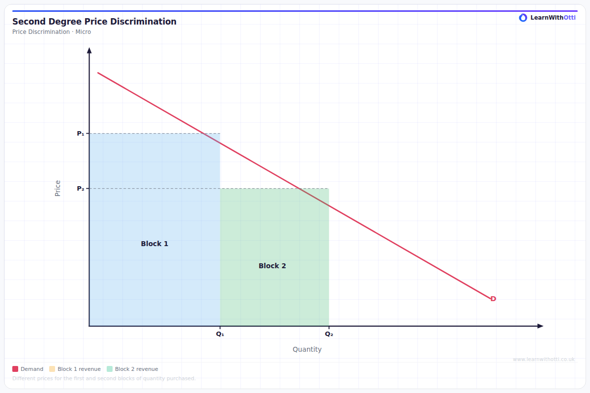
Diagram showing block pricing (second-degree price discrimination), where consumers pay different prices for different quantities consumed, such as utility tariffs.
Printable preview
Download a static PNG of this diagram to print or include in revision notes.
Download PNGWhat this diagram shows
Second-degree price discrimination shows how firms charge different prices per unit based on the quantity consumed, with consumers paying less per unit as they buy more. The diagram typically displays a downward-sloping demand curve with different price blocks or tiers, where early units are expensive but additional units become progressively cheaper. This pricing strategy allows firms to capture more consumer surplus than uniform pricing while encouraging higher consumption levels. Common examples include bulk discounts, utility companies' tiered pricing, and mobile phone contracts with different data allowances.
Key points
- Consumers are charged different prices per unit depending on the quantity they purchase, creating price tiers or blocks
- The firm doesn't need to identify different consumer types - customers self-select into pricing tiers based on their consumption needs
- Early units consumed are priced higher, with subsequent units offered at progressively lower prices per unit
- This captures more consumer surplus than uniform pricing while encouraging increased consumption
- Total revenue is represented by the combined areas under each price block, showing how the firm extracts value from different consumption levels
Exam tip
Examiners are impressed when students clearly explain that second-degree price discrimination involves offering different quantities at different per-unit prices, not just different total prices. Always emphasize that consumers self-select into different pricing tiers based on their willingness to pay, and that this allows firms to capture more consumer surplus than uniform pricing.
Common mistakes
Students often confuse this with first-degree discrimination, incorrectly thinking the firm charges each consumer a different price for the same quantity. The key mistake is not understanding that all consumers face the same pricing structure but choose different quantities based on their preferences.
Exam board notes
All major exam boards treat this diagram identically. However, AQA and Edexcel tend to focus more on real-world applications like utility pricing, while OCR may emphasize the mathematical relationship between price blocks and consumer surplus extraction.
Related diagrams
Ask Otti about this diagram
Our AI tutor can walk you through every curve, explain exam technique, and quiz you on it.