Cross Elasticity of Demand — Complements
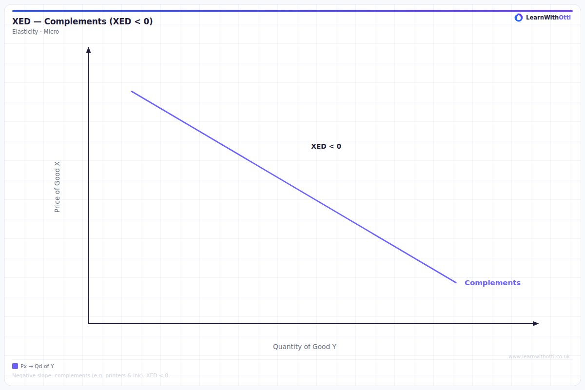
Diagram showing negative cross elasticity of demand between complementary goods, where a rise in the price of one good reduces demand for the other.
Printable preview
Download a static PNG of this diagram to print or include in revision notes.
Download PNGWhat this diagram shows
Cross elasticity of demand for complements measures how responsive the demand for one good is to changes in the price of a related complementary good. The diagram shows that when the price of good A increases, the demand curve for good B (its complement) shifts inward to the left, demonstrating a negative cross elasticity. This reflects real-world situations like how rising petrol prices reduce demand for cars, or how expensive printer prices affect ink cartridge demand. Understanding this relationship helps explain consumer behaviour and business pricing strategies.
Key points
- Cross elasticity of demand for complements is always negative (XED < 0)
- An increase in the price of good A causes a leftward shift in demand for complement good B
- The stronger the complementary relationship, the more negative the cross elasticity value
- The demand curve shifts (doesn't move along) because price of a different good is changing
- Common examples include cars and petrol, printers and ink cartridges, or phones and phone cases
Exam tip
Always remember that for complements, cross elasticity of demand is negative - when the price of one good rises, demand for its complement falls. Many students forget the negative sign or confuse the direction of the relationship, so always check your answer makes economic sense.
Common mistakes
Students often confuse movement along the demand curve with shifts of the demand curve - remember this shows a shift because we're changing the price of a different good. Another frequent error is forgetting that the cross elasticity value must be negative for complements.
Exam board notes
All major exam boards treat this diagram identically, though OCR tends to emphasise numerical calculations of cross elasticity values more than the others. CIE occasionally includes more complex scenarios with multiple complementary goods in their higher-tier questions.
Related diagrams
Ask Otti about this diagram
Our AI tutor can walk you through every curve, explain exam technique, and quiz you on it.