Cross Elasticity of Demand — Substitutes
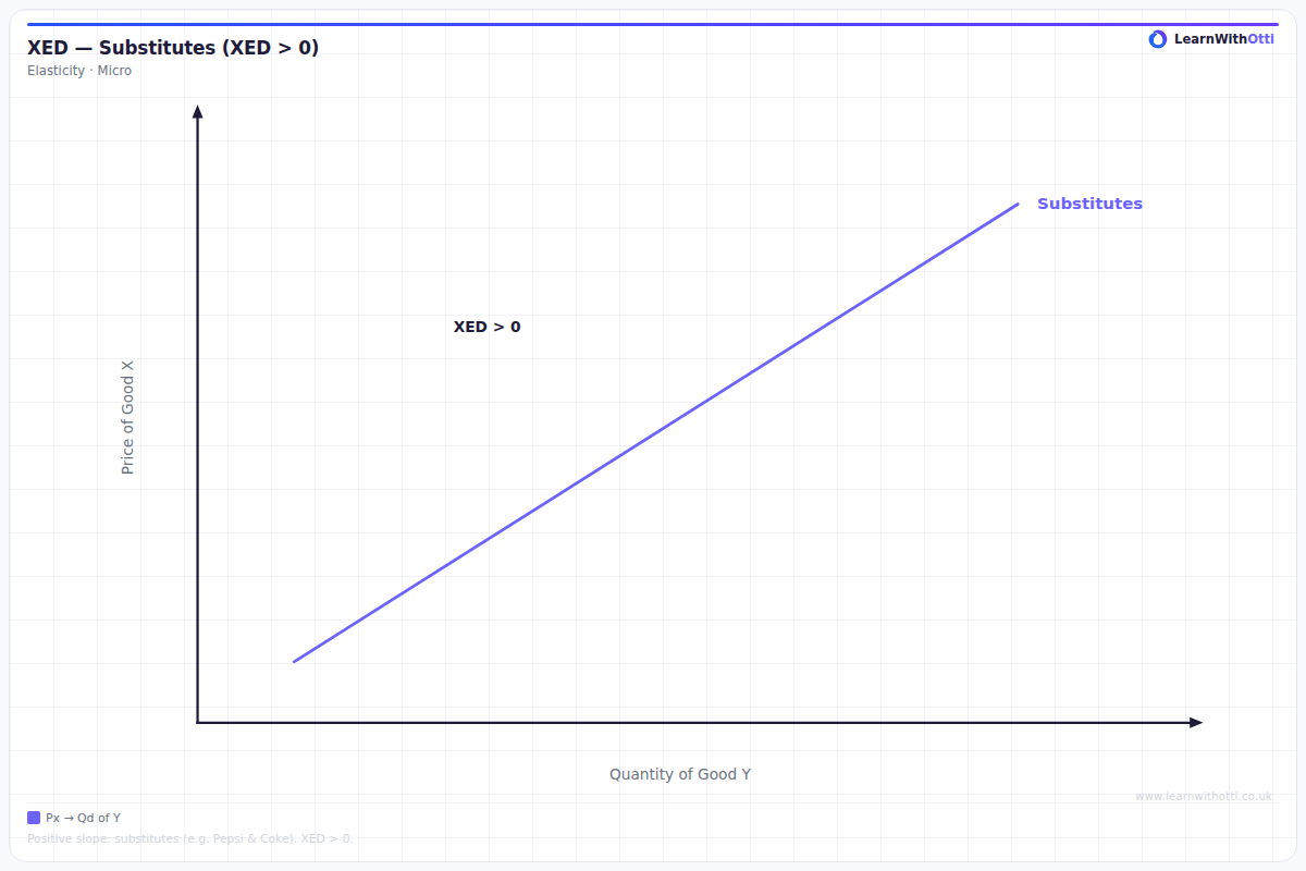
Diagram showing positive cross elasticity of demand between substitute goods, where a rise in the price of one good increases the demand for the other.
Printable preview
Download a static PNG of this diagram to print or include in revision notes.
Download PNGWhat this diagram shows
This diagram illustrates how the demand for one good responds when the price of a substitute good changes. When two goods are substitutes (like Coca-Cola and Pepsi), they compete for the same consumers, so if one becomes more expensive, consumers switch to the alternative. The diagram shows that as the price of Good A increases, the quantity demanded of Good B (the substitute) increases, creating a positive relationship that slopes upward from left to right.
Key points
- Cross elasticity of demand for substitutes is always positive because price and quantity demanded move in the same direction
- The steeper the slope, the stronger the substitutability between the goods - closer substitutes show a steeper positive relationship
- Perfect substitutes would show a perfectly elastic (horizontal) demand curve, while weak substitutes show a gentle upward slope
- The x-axis shows the price of Good A, while the y-axis shows the quantity demanded of Good B (the substitute good)
- Real-world examples include butter and margarine, different brands of smartphones, or tea and coffee
Exam tip
Examiners are impressed when students can clearly explain the direction of the relationship between substitute goods - when the price of one good rises, demand for its substitute increases. Always remember to state that cross elasticity of demand for substitutes is positive, and be specific about which good's price is changing and which good's demand is responding.
Common mistakes
Students often confuse the axes, plotting the same good on both axes instead of showing how one good's price affects a different good's demand. Another frequent error is drawing a negative relationship, confusing substitutes with complements.
Exam board notes
All major exam boards treat this diagram identically, focusing on the positive relationship and the concept of substitute goods competing for consumer demand.
Related diagrams
Ask Otti about this diagram
Our AI tutor can walk you through every curve, explain exam technique, and quiz you on it.