Income Elasticity of Demand — Normal Good
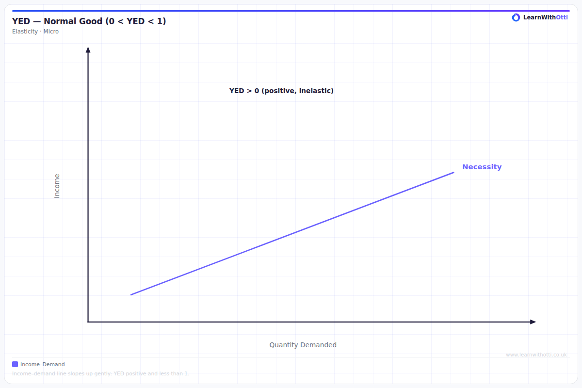
Diagram showing positive income elasticity of demand for normal goods, where a rise in income increases the quantity demanded at every price.
Printable preview
Download a static PNG of this diagram to print or include in revision notes.
Download PNGWhat this diagram shows
This diagram shows the relationship between changes in consumer income and quantity demanded for a normal good, where both variables move in the same direction. As income increases, consumers demand more of the good, creating a positive correlation shown by the upward-sloping curve. The gradient of this curve tells us whether the good is a necessity (flatter curve, YED 0 to +1) or a luxury (steeper curve, YED greater than +1). Understanding this relationship is crucial for businesses predicting demand changes during economic growth or recession.
Key points
- Normal goods have positive income elasticity of demand (YED > 0) - as income rises, demand increases
- The upward-sloping curve shows the positive relationship between income and quantity demanded
- A flatter curve indicates a necessity (YED between 0 and +1) - demand increases less than proportionally to income
- A steeper curve indicates a luxury good (YED > +1) - demand increases more than proportionally to income
- The exact YED value is calculated as the percentage change in quantity demanded divided by percentage change in income
Exam tip
Always remember that normal goods have positive income elasticity values, and the steeper the curve, the more income elastic the good is. Examiners are impressed when students can distinguish between necessities (YED between 0 and +1) and luxuries (YED greater than +1) using the gradient of the curve.
Common mistakes
Students often confuse the axes, putting price instead of income on the vertical axis, or forget that the steepness of the curve indicates whether it's a necessity or luxury. Another frequent error is stating that all normal goods are luxuries, when in fact most normal goods are actually necessities.
Exam board notes
All major exam boards treat this diagram identically, requiring students to understand the positive relationship and distinguish between necessities and luxuries based on YED values. Some boards may emphasise real-world applications more than others in their mark schemes.
Related diagrams
Ask Otti about this diagram
Our AI tutor can walk you through every curve, explain exam technique, and quiz you on it.