Income Elasticity of Demand — Luxury Good
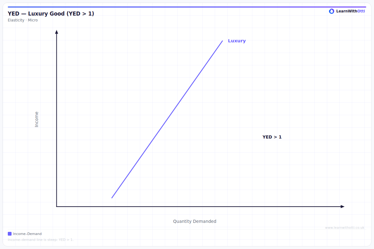
Diagram showing income elasticity of demand greater than 1 for luxury goods, where demand rises more than proportionally with income.
Printable preview
Download a static PNG of this diagram to print or include in revision notes.
Download PNGWhat this diagram shows
This diagram shows how demand for a luxury good responds to changes in consumer income, with income elasticity of demand (YED) greater than +1. The curved relationship demonstrates that as income increases, the percentage change in quantity demanded increases at an accelerating rate. This explains why luxury brands see dramatic sales growth during economic booms and why wealthy consumers spend disproportionately more on luxury items as their income rises.
Key points
- YED for luxury goods is always greater than +1, meaning demand is income elastic
- The curve slopes upward and becomes progressively steeper, showing accelerating responsiveness to income changes
- At low income levels, demand may be close to zero as the good is unaffordable
- The non-linear relationship explains why luxury markets are highly volatile during economic cycles
- Examples include designer goods, expensive cars, fine dining, and premium holidays
Exam tip
Examiners are impressed when students can explain why the curve becomes steeper as income rises - this shows understanding that luxury goods become increasingly responsive to income changes at higher income levels. Many students incorrectly assume all income elasticity curves are straight lines, so demonstrating knowledge of the non-linear relationship for luxury goods will stand out.
Common mistakes
Students often draw this as a straight line rather than a curve, missing the key point that responsiveness increases with income levels. They also frequently confuse luxury goods with normal goods, forgetting that YED must exceed +1 for a good to be classified as luxury.
Exam board notes
All major exam boards treat this diagram identically, requiring students to understand the non-linear relationship and YED > +1. Some boards like AQA may place greater emphasis on real-world applications and examples in their mark schemes.
Related diagrams
Ask Otti about this diagram
Our AI tutor can walk you through every curve, explain exam technique, and quiz you on it.