Income Elasticity of Demand — Inferior Good
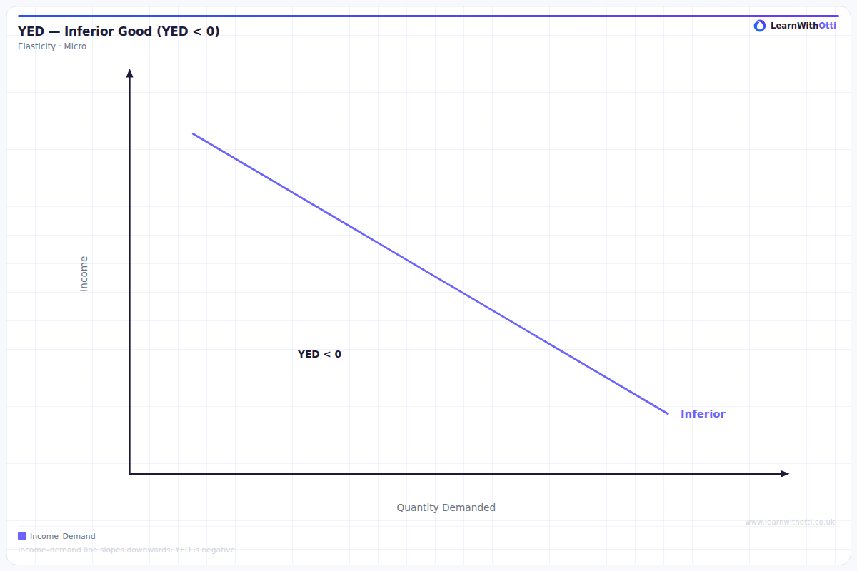
Diagram showing negative income elasticity of demand for inferior goods, where demand falls as income rises because consumers switch to superior alternatives.
Printable preview
Download a static PNG of this diagram to print or include in revision notes.
Download PNGWhat this diagram shows
This diagram illustrates the relationship between income changes and quantity demanded for inferior goods, showing a negative correlation. As consumer income increases along the x-axis, the quantity demanded decreases along the y-axis, creating a downward-sloping curve. This occurs because consumers substitute inferior goods with higher-quality alternatives as their purchasing power improves. The steepness of the curve indicates how responsive demand is to income changes - the steeper the curve, the more income elastic the inferior good.
Key points
- Income elasticity of demand for inferior goods is always negative (YED < 0)
- The curve slopes downward from left to right, showing the inverse relationship between income and demand
- As income rises, consumers switch to superior alternatives, reducing demand for the inferior good
- The steepness of the curve indicates the degree of income elasticity - steeper curves mean more elastic demand
- Examples include instant noodles, generic brands, public transport, and second-hand goods
Exam tip
Always remember that inferior goods have negative income elasticity of demand - this is the key distinguishing feature that examiners look for. Students who can clearly explain why the relationship is inverse (as income rises, demand falls) and provide relevant examples like instant noodles or generic brands will impress examiners.
Common mistakes
Students often confuse inferior goods with normal goods and draw an upward-sloping curve instead of downward-sloping. They also frequently forget that the income elasticity coefficient must be negative for inferior goods.
Exam board notes
All major exam boards treat this diagram identically, requiring students to understand the negative relationship and be able to provide relevant real-world examples. The mathematical relationship (YED < 0) is consistently tested across all specifications.
Related diagrams
Ask Otti about this diagram
Our AI tutor can walk you through every curve, explain exam technique, and quiz you on it.