Business (Trade) Cycle
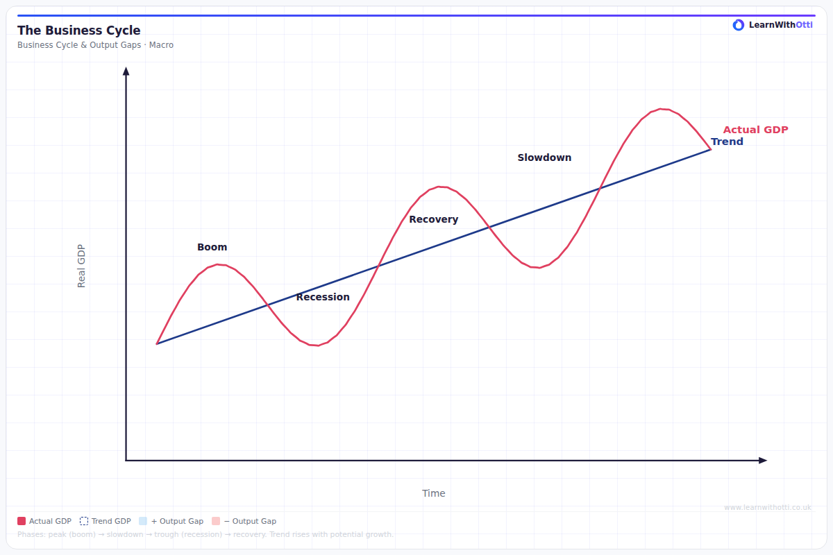
Diagram of the economic business cycle showing boom, recession, trough, and recovery phases relative to trend GDP growth, along with output gap fluctuations.
Printable preview
Download a static PNG of this diagram to print or include in revision notes.
Download PNGWhat this diagram shows
The business cycle diagram illustrates how an economy's real GDP fluctuates around its long-term trend growth rate over time. It shows the cyclical pattern of economic expansion and contraction that all market economies experience, moving through phases of boom, recession, trough, and recovery. This diagram is crucial for understanding macroeconomic policy timing and helps explain why governments and central banks intervene at different points in the cycle. The amplitude and frequency of these cycles can vary significantly between countries and time periods.
Key points
- The cycle has four main phases: boom/peak (maximum economic activity), recession/contraction (declining GDP), trough (minimum economic activity), and recovery/expansion (increasing GDP)
- The long-term trend line shows the economy's potential growth rate - actual GDP oscillates above and below this trend
- During booms, unemployment falls and inflation typically rises; during recessions, unemployment rises and inflationary pressure decreases
- Output gaps occur when actual GDP differs from potential GDP - positive gaps during booms create inflationary pressure, negative gaps during recessions create deflationary pressure
- Government fiscal policy and monetary policy are often used counter-cyclically to smooth out these fluctuations and maintain stable economic growth
Exam tip
Examiners are impressed when students can link specific phases of the trade cycle to real-world examples and policy responses. Students commonly fail to distinguish between the rate of economic growth (which can be positive even during a downturn) and the actual level of economic activity - remember that GDP can still be growing during a recession, just at a slower rate than the long-term trend.
Common mistakes
Students frequently confuse a recession (negative growth for two consecutive quarters) with simply growing below the trend rate - an economy can be in the contraction phase while still experiencing positive GDP growth. Many also incorrectly assume that all economic indicators move in perfect synchronisation with the cycle.
Exam board notes
All major exam boards treat this diagram identically, though OCR places slightly more emphasis on linking the trade cycle to labour market conditions and unemployment patterns. AQA and Edexcel are more likely to combine trade cycle questions with fiscal and monetary policy evaluation.
Related diagrams
Ask Otti about this diagram
Our AI tutor can walk you through every curve, explain exam technique, and quiz you on it.