SRAS Shift Right (Positive Supply Shock)
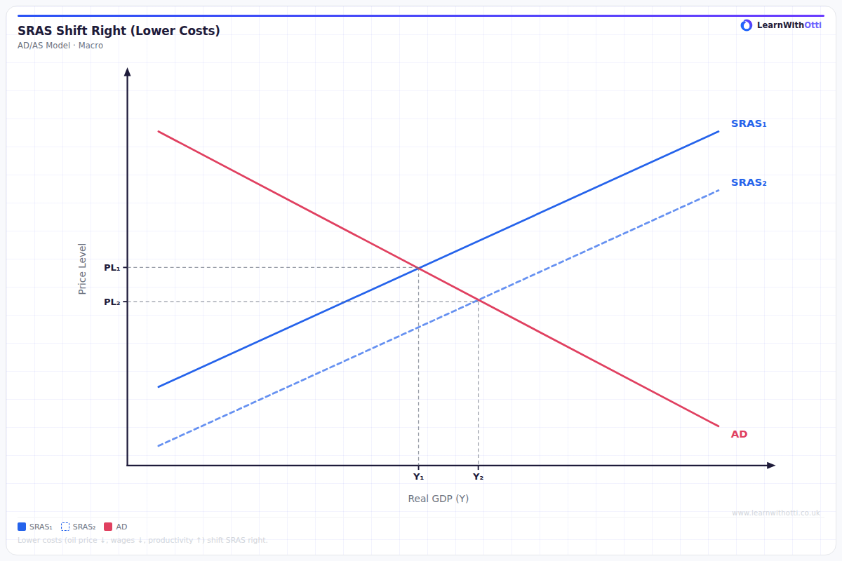
AD/AS diagram showing a rightward SRAS shift due to falling input costs or technology improvement, reducing inflation and raising real output simultaneously.
Printable preview
Download a static PNG of this diagram to print or include in revision notes.
Download PNGWhat this diagram shows
This diagram shows the Short-Run Aggregate Supply (SRAS) curve shifting to the right, representing a positive supply shock to the economy. When SRAS shifts right, it means firms can produce more output at every price level, typically due to lower production costs or improved productivity. This results in a new macroeconomic equilibrium with higher real GDP and lower price levels, demonstrating how supply-side improvements can simultaneously boost economic growth while reducing inflationary pressure.
Key points
- The rightward shift of SRAS represents an increase in short-run aggregate supply at all price levels
- Common causes include falling raw material prices, lower wage costs, improved technology, or reduced business taxes
- The new equilibrium shows higher real GDP (economic growth) and a lower price level (deflationary pressure)
- This creates a win-win scenario of increased output with reduced inflation, unlike demand-side growth
- The shift is 'short-run' because it assumes at least one factor of production (usually capital) remains fixed
Exam tip
Always clearly label both the old and new equilibrium points (e.g. Y1 to Y2, P1 to P2) and use arrows to show the direction of the SRAS shift. Examiners are impressed when you can link the shift to specific real-world examples like falling oil prices or technological improvements.
Common mistakes
Students often confuse movements along the SRAS curve with shifts of the entire curve, or incorrectly show the price level rising instead of falling. Another frequent error is failing to explain that this represents a change in production costs rather than a change in aggregate demand.
Exam board notes
All major exam boards treat this diagram identically, though Edexcel tends to place slightly more emphasis on distinguishing between short-run and long-run supply shifts in their mark schemes.
Related diagrams
Ask Otti about this diagram
Our AI tutor can walk you through every curve, explain exam technique, and quiz you on it.