Keynesian AS Curve Shift Right (Increase in Productive Potential)
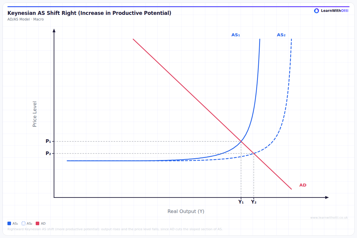
Keynesian AD/AS diagram showing the Keynesian AS curve shifting right due to an increase in productive potential, raising real output and lowering the price level where AD cuts the sloped section.
Printable preview
Download a static PNG of this diagram to print or include in revision notes.
Download PNGWhat this diagram shows
The Keynesian AS curve has three distinct sections: a horizontal section (spare capacity), an upward-sloping section (bottlenecks emerging), and a near-vertical section (full employment). When the Keynesian AS curve shifts right, it means the economy's productive potential has increased — the maximum output the economy can produce at full employment has risen. This is significant because it shows the economy can now sustain higher levels of real output without necessarily triggering inflation, which is a key policy goal for governments pursuing long-run economic growth.
Key points
- A rightward shift of the Keynesian AS curve represents an increase in productive potential, meaning the economy can produce more output at every price level
- The horizontal section of the curve extends further to the right, indicating that more output can be achieved without upward pressure on the price level — particularly important in a recession context
- Common causes of the shift include improvements in technology, increases in the quantity or quality of factors of production (e.g. better education/training), and supply-side policy reforms
- Unlike the LRAS curve in the monetarist model, the Keynesian AS shift shows that the economy may still have spare capacity even after the shift — the vertical portion moves right but the shape is retained
- A rightward shift allows AD to increase without inflation if the economy is operating on the horizontal portion, making it especially relevant for evaluating the impact of supply-side policies during periods of unemployment
Exam tip
Students often confuse a rightward shift of the Keynesian AS curve with a movement along it — examiners want you to clearly distinguish between a change in productive potential (shift) and a change in the price level causing a movement along the curve. To impress examiners, explicitly link the shift to long-run supply-side improvements and explain why the horizontal section extends further right before the vertical portion is reached.
Common mistakes
Students frequently draw the entire Keynesian AS curve simply moving to the right without maintaining its distinctive three-section shape, which loses them marks for diagram accuracy. They also incorrectly state that any increase in output represents a shift, when output can increase through a movement along the existing curve if AD rises.
Exam board notes
AQA and Edexcel both use the Keynesian AS curve and expect students to explain a rightward shift in terms of an increase in productive potential rather than a movement along the curve. Edexcel places particular emphasis on distinguishing this shift from a monetarist LRAS shift, while AQA more often asks students to link the shift directly to a specific supply-side policy.
Related diagrams
Ask Otti about this diagram
Our AI tutor can walk you through every curve, explain exam technique, and quiz you on it.